patafea's logo was first created in 2007 using a funky duck that was one of the illustrations in the 1st Edition of HECK NO! TECH NO! At that time I didn't have the TECHNO-SKILLS to create anything on my own, so I just took the duck file from the book's jpeg artist's files, gave her some funky hair a Daffodil in one hand and an American/British flag in the other hand and sat her on my signature.....
 .....and there she sat until 2020 when I started to rewrite HECK NO! TECH NO! and needed an updated BizCard! I hired someone from 'fivesquid' to draw a duck that would be a depiction of me, sending some pics of me, earrings, my necklace, etc., to work off of. This is what i got on the first go around!
![]()

Then I had a go myself! YIKES! In looking back, after my 2 1/2 year journey into TECHNO-STRESS and TECHNO-HELL, I guess I must have had a premonition of what I would look like down the road..............down right scary!
![]()
But, it was a start....until it got scarier! After this image below, the Artist decided he couldn't give me what I had described, and even though he was getting close and I asked to to stick with it, he quit on me and gave me the image!
![]() I decided to have another go at taking this image and making a logo design that was a bit more interesting...which produced the logo image below, but I still was not happy with the Duck not being a depiction of me...
I decided to have another go at taking this image and making a logo design that was a bit more interesting...which produced the logo image below, but I still was not happy with the Duck not being a depiction of me...
![]() ...so, I sent all the info to a Graphic Designer friend of mine, Eddie at Fuzzy Duck (we Ducks Quack together) in Minnesota and we started from there! The rest...Quack! Quack!... is History! Eddie did not feel that the above logo was of a 'Brand Quality' that he knew I needed to cover the Portfolio that I am building. What came out of the images I sent and the discussions that we had was this new patafeaCreative Brand Logo to represent my 'Creative Brain'!
...so, I sent all the info to a Graphic Designer friend of mine, Eddie at Fuzzy Duck (we Ducks Quack together) in Minnesota and we started from there! The rest...Quack! Quack!... is History! Eddie did not feel that the above logo was of a 'Brand Quality' that he knew I needed to cover the Portfolio that I am building. What came out of the images I sent and the discussions that we had was this new patafeaCreative Brand Logo to represent my 'Creative Brain'!

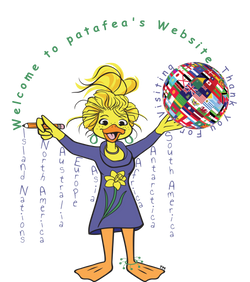
Then a Standing image was created and the Sitting Duck was available in a separate file so I could use them as I wanted. As you can see below they are now entertaining my Website and Audience, and, of course, Me! I take these two great images that Eddie produced and then add additional designs to illustrate and accent the pages that she is on! The patafea image has, one of my hair styles, my freckles, fun earrings that I like to wear, a Daffodil on her dress (my favourite flower), a figure that is shaped with a sprinkle of dreaming about a few years ago!!, and an Indian Ankle bracelet, remembering my days living in India!


Below, in page order of my Website, are the Bespoke images of patafea. Note that there are two images (except the two images on cameras) with the same Title/Theme. The Logo on the left is the new updated logo that I did in June and the logo on the right is the original image I did in December/January 2021! As I update and create new images, I will add them to this Blog! ENJOY!
![]()


![]()


![]()
![]()
![]()

![]()


![]()


![]()
![]()
![]()
![]() The Bookings and Contact Logos above have remained unchanged, hence there is no second image for each of them.
The Bookings and Contact Logos above have remained unchanged, hence there is no second image for each of them.